
How To Choose The Right Wallpaper For Your Space
How To Choose The Right Wallpaper For Your Space
Wallpaper is one of the quickest, most cost-effective ways to transform a room—but it’s also one of the easiest places to second-guess yourself. Will it feel too busy? Too trendy? Too permanent?
Here’s the truth after decades of seeing what works in real homes: choosing wallpaper isn’t about having “perfect taste.” It’s about using a simple decision framework so your pick feels intentional—and looks amazing in your space.
This guide walks you through five practical choices:
-
Where to use wallpaper
-
How much to use
-
Which style fits your space
-
How to choose color + pattern (without regret)
-
When texture matters (and when it doesn’t)
And yes—there’s a fun bonus at the end: one customer used leftover leopard wallpaper to upgrade a plain suitcase into a designer-looking statement piece.
The 5-Step Wallpaper Decision Framework (Use This Every Time)
Before you buy anything, answer these five questions in this order:
-
Where are you using it? (room conditions + how it’s used)
-
How much are you covering? (full wall vs accent vs small surfaces)
-
What style are you matching? (modern, classic, boho, minimal, etc.)
-
What color + pattern rules apply? (scale, stripes, contrast)
-
Do you want texture? (flat, linen-look, metallic, grasscloth vibe)
This keeps you from shopping by impulse and helps you choose like a designer.
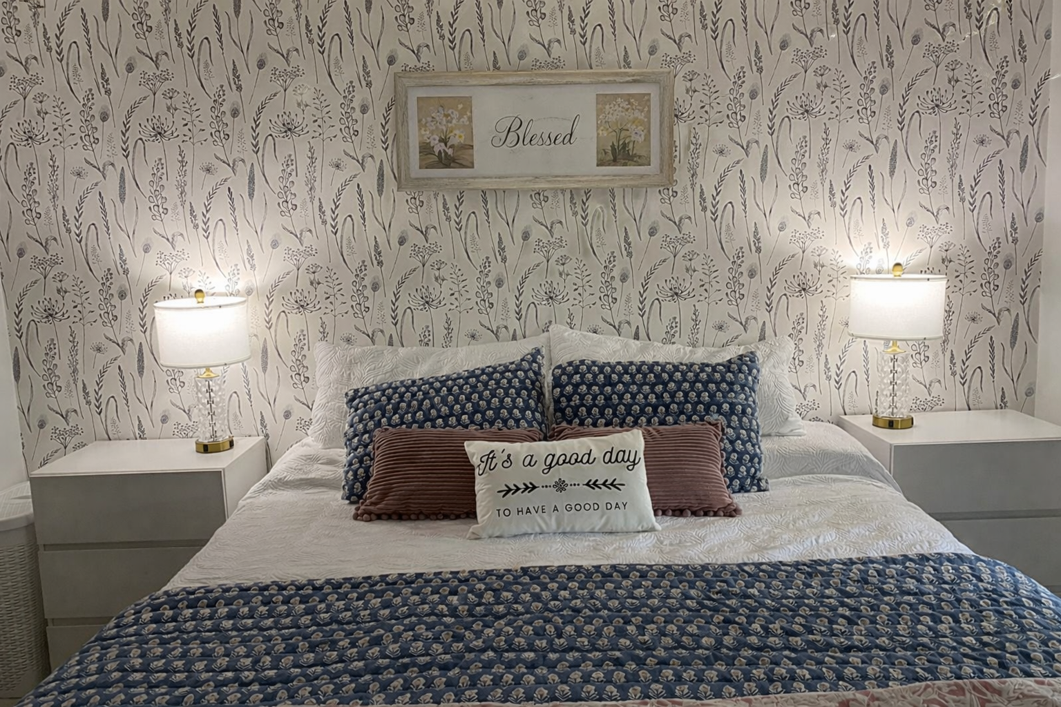
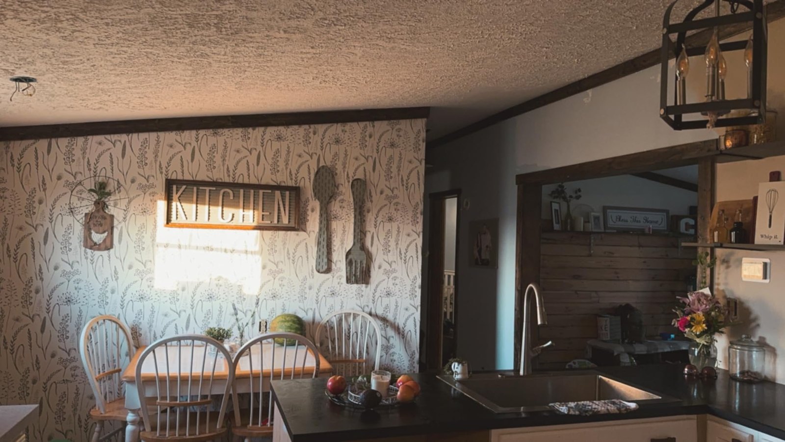
1) Perfect Spaces for Wallpaper (Where It Works Best)
If you’re new to wallpaper, don’t start with the biggest, most visible wall in your home. Start where wallpaper gives you high impact with low risk.
Best “first wallpaper” spaces
-
Entryway / foyer: Instant wow factor when you walk in
-
Hallways: Small surface area, major transformation
-
Nooks & alcoves: Built-in focal points that look intentional
-
Powder room: Small room, dramatic payoff
-
Behind shelves / bookcases: Looks custom, no overwhelm
What about bathrooms?
Powder rooms are perfect for wallpaper. In full bathrooms, wallpaper works best with good ventilation and away from direct splash zones. (Peel-and-stick is a popular choice for bathrooms because it’s easy to update later.)
Pro tip: If you’re nervous about bold pattern, choose a small space. Big pattern in a small room often looks more intentional than a timid print on a big wall.
2) Placement: How Much Wallpaper Should You Use?
Most wallpaper “mistakes” aren’t because the wallpaper is bad. They happen because it’s used in the wrong amount or the wrong place.
Here are placement options that almost always look good:
Option A: One accent wall (the classic)
Great for bedrooms (behind the bed), living rooms (behind a sofa), or dining rooms.
Option B: Half wall (designer look, less material)
Using wallpaper above wainscoting or a chair rail creates a layered, high-end feel—and lowers cost.
Option C: Highlight a feature
Wallpaper can spotlight a fireplace wall, a reading corner, or the space behind a console.
Option D: Ceiling (the “fifth wall”)
This is bold and beautiful—especially in small rooms like powder rooms or nurseries. If your ceiling is low, choose lighter colors or softer patterns.
Option E: Small-surface “high impact” upgrades
If you want a big result without committing to a wall:
-
Back of a bookshelf
-
Inside open cabinets
-
Closet feature wall
-
Behind a bar cart or desk area
Rule of thumb: If the wallpaper is dramatic, use it where it can be the star—then keep the rest of the room calmer.
3) Style: Match Wallpaper to Your Interior (Not a Trend)
A lot of people still associate wallpaper with old-fashioned floral. Modern wallpaper is a completely different world.
Here’s an easy way to choose: look at your space and decide what style it already leans toward—then pick wallpaper that supports it.
Quick style matching guide
-
Modern / Minimal: clean geometrics, tone-on-tone patterns, simple lines
-
Scandi / Japandi: soft neutrals, organic shapes, subtle texture
-
Boho / Natural: botanicals, earthy palettes, woven/linen vibes
-
Mid-century / Retro: playful repeats, warm colors, bold shapes
-
Classic / Timeless: stripes, elegant motifs, refined florals
-
Glam / Luxury: metallic accents, dramatic contrast, rich tones
Pro tip: If your furniture is already busy (lots of patterns, textures, decor), choose calmer wallpaper. If your furniture is clean and simple, your wallpaper can do more of the talking.
4) Color + Pattern: The Rules That Prevent Wallpaper Regret
This is where people get stuck—so let’s make it simple.
Choose one of two color strategies
Strategy 1: Reinforce your existing palette
Pick wallpaper that includes at least one color already in your room (rug, curtains, pillows, art).
Strategy 2: Add one “hero” color
Introduce one new color through wallpaper and keep the rest of your palette neutral. This makes the wallpaper feel intentional, not random.
Pattern scale matters more than you think
-
Small patterns can feel busy in small spaces
-
Medium and large patterns often look more elevated and less cluttered
-
Big prints can make tiny rooms look designed—like a boutique hotel powder room
Stripes are the easiest visual trick
-
Vertical stripes can make ceilings feel taller
-
Horizontal stripes can make narrow rooms feel wider
If you want a “safe” pattern with high payoff, stripes are a classic move.
5) Texture + Dimension: How to Make Wallpaper Look Expensive
If you want wallpaper to look premium, don’t focus only on the print—pay attention to the finish.
Texture adds depth even in a neutral color palette. Great options include:
-
Linen or fabric-look finishes (soft, upscale, timeless)
-
Subtle metallic highlights (beautiful in dining rooms with warm lighting)
-
Grasscloth-inspired looks (warm, natural, layered)
Texture is how you get that “designer” feel without needing louder colors.
Why Peel-and-Stick Wallpaper Is the Smart Low-Risk Choice
If you’re renting, decorating for the first time, or you like switching styles seasonally, peel-and-stick wallpaper is a practical way to start.
People love it because it’s:
-
DIY-friendly (no paste, no mess)
-
Removable (less fear, more freedom)
-
Fast (weekend-level projects)
-
Perfect for small upgrades (shelves, nooks, closets, cabinets)
It turns wallpaper from a permanent commitment into a flexible design tool.
Bonus: The Leftover Wallpaper Hack We Love (Leopard Suitcase Makeover)
Here’s a real customer idea that proves wallpaper isn’t just for walls:
After finishing a project, one customer had leftover leopard peel-and-stick wallpaper—and used the scraps to upgrade a plain rolling suitcase.
The result looks like a custom designer travel case: bold, fun, and surprisingly polished.
Why it worked so well:
-
Leopard print hides scuffs better than solid colors
-
Suitcase panels are flat and easy to wrap
-
It’s a small-surface project with big impact
-
Leftovers don’t go to waste
If you ever end up with extra wallpaper, don’t toss it. This kind of mini makeover is where peel-and-stick really shines.

Quick Checklist: Pick the Right Wallpaper in 60 Seconds
Use this checklist when you’re browsing:
-
✅ Space: entryway, hall, nook, powder room, or feature wall
-
✅ Coverage: accent wall / half wall / shelf backing
-
✅ Style match: modern, classic, boho, minimal, glam
-
✅ Color plan: match your palette or add one hero color
-
✅ Pattern scale: medium/large for small spaces; stripes for easy wins
-
✅ Finish: flat for minimal; textured/metallic for depth
-
✅ Lifestyle: peel-and-stick if you want low risk and easy updates
If you can answer these, you can choose wallpaper with confidence—and stop opening extra tabs.
Final Tip: Start Small, Win Big
If you’re still unsure, begin with a small space (entryway, hallway, powder room, or bookshelf backing). It’s the fastest way to build confidence and get a high-end result without feeling overwhelmed.
When you’re ready, pick a peel-and-stick wallpaper pattern you love, follow the 5-step framework, and make your space feel brand new—without the commitment.
