
How to Plan a Wall Decal Layout: Spacing, Height, and Focal Point
A No-Regret, Psychology-Backed Guide That Looks Designer-Clean (Even for First-Timers)
Peel-and-stick wall decals are one of the easiest ways to refresh a room—without paint, without a contractor, and without the “permanent commitment” feeling. JIFFDIFF wall decals are designed to be repositionable, removable, and damage-free, which means you can test your layout, step back, adjust, and get it right.
But here’s the honest truth:
Most “it looks kind of off” results aren’t about the decal. They’re about layout.
This guide gives you a clear method—based on how people actually see walls (visual psychology), how people actually view walls (comfort viewing/ergonomics), and how people actually decide (reducing decision overload so you don’t freeze or second-guess).
Quick Take (for busy DIYers)
If you remember only three things:
-
Start with one focal point (a “hero” decal).
-
Set the height for comfort (most walls look wrong because the focal point is too high).
-
Spacing must be consistent—and you should test it from 6–8 feet away using a simple spacer method.
Table of Contents
-
Why decal layouts feel “off” (and how to fix it fast)
-
The 5 tools you need (no fancy equipment)
-
Step 1 — Choose your wall zone (so the layout has a frame)
-
Step 2 — Choose the focal point (the decision shortcut that makes the wall look designed)
-
Step 3 — Set the height (comfort viewing rule + real-life checks)
-
Step 4 — Set spacing (the psychology + the 10-minute spacer test)
-
Step 5 — Mock up before you stick (the no-regret step)
-
Step 6 — Install cleanly (and fix bubbles/crooked lines)
-
Room-by-room layout recipes (copy/paste formulas)
-
Shopping checklist (so your layout stays cohesive)
-
FAQs
1) Why decal layouts feel “off”
People usually blame:
-
“Maybe I chose the wrong design.”
-
“Maybe I need more pieces.”
-
“Maybe the wall is just hard.”
But layout problems typically come from one of these:
-
No focal point (everything competes; it reads as clutter)
-
Wrong height (the wall forces your eyes up; it feels awkward)
-
Inconsistent spacing (the brain reads it as random)
This guide fixes those three issues in a repeatable way.
2) Tools You Need (simple + cheap)
You don’t need a designer’s toolkit. Grab:
-
Painter’s tape
-
Pencil
-
Tape measure
-
A phone camera
-
Cardboard strips (cut 3 spacers: 2" / 3" / 4" wide)
Those spacers are the “secret weapon” that makes your wall look premium.
Step 1 — Choose Your Wall Zone (Give the layout a frame)
A blank wall is infinite. Infinite options create hesitation.
So we create a boundary first.
Choose one wall zone type:
A) Above furniture (sofa, bed, crib, console, desk)
B) Between architectural lines (door + window gap, stair landing, reading nook)
C) A taped rectangle (a “design box” you can remove later)
The simplest rule that prevents 80% of “something’s off”
If your decals are going above furniture, keep the overall layout:
-
roughly within the furniture width, or
-
only slightly wider (a gentle overflow looks intentional)
Huge mismatch (tiny furniture + huge decal spread) is one of the fastest ways to make a wall feel unbalanced.
Quick measurement checklist
Write these down:
-
Wall zone width (inches)
-
Wall zone height (inches)
-
Any obstacles (switch plates, vents, shelves, headboards)
-
Your main viewing spot (sofa, doorway, bed)
That “viewing spot” matters more than people think.
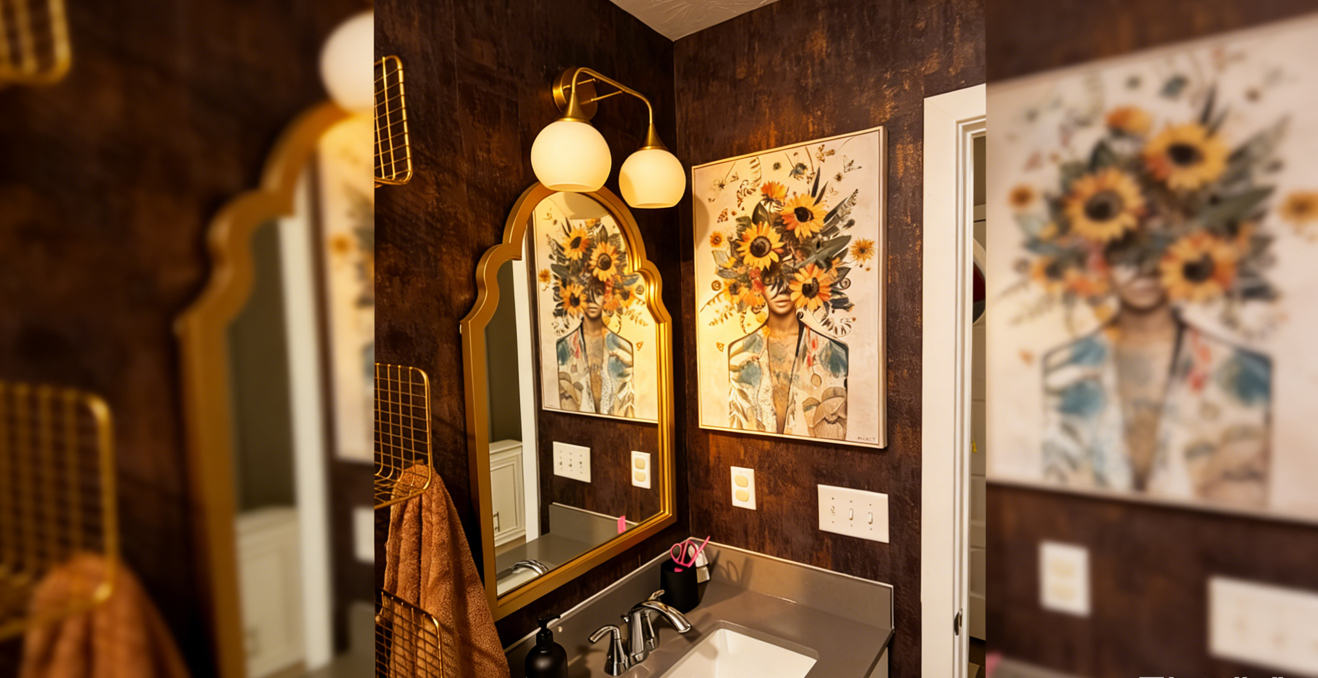
Step 2 — Pick ONE Focal Point (Your “hero” decal)
If you put five equal decals on a wall, your brain doesn’t know where to rest—so it reads as messy.
There’s also a decision-behavior effect: when people face too many equal choices, they’re more likely to hesitate and feel less satisfied with the final decision. That’s why “just start sticking” often leads to random placement.
So we simplify: choose one hero.
Your focal point can be:
-
The largest piece
-
The most detailed piece
-
A strong shape that anchors the wall (arches are amazing for this)
Focal Point Starter Options (JIFFDIFF examples)
-
Statement arch: easy to center and build around.
Example size: 34.6" × 64.6". -
Wide scene above a bed/crib: instant calm composition.
Example size: 39" × 17". -
Large themed scene for playrooms / laundry / kids corners.
Example size: 59.8" × 29.5".
The “Focal Point Test” (30 seconds)
Stand at your main viewing spot.
Ask: “Where do I want my eyes to land first?”
That spot is your focal point location.

Step 3 — Height: Comfort Viewing Beats “Too High” Every Time
Most DIY décor ends up too high because people think:
“Upper wall = decoration space.”
But humans don’t comfortably view walls that way.
The comfort principle (simple and real)
Ergonomics guidance consistently notes that viewing slightly downward is more comfortable and that looking upward is tiring over time.
That’s why many “too-high” walls feel subtly uncomfortable—even if you can’t explain why.
The Practical Height Rules (start here)
Use these as starting points, then confirm with a step-back test:
A) Standing zones (hallways, entryways, open walls)
-
Place the visual center of the focal decal around 57–60 inches from the floor.
B) Seated zones (behind a sofa, above a bed)
-
Lower it by 2–6 inches (because your eyes are lower when seated).
C) Kids zones
-
Lower the focal point so it feels welcoming at child height—especially if it’s a themed scene.
Above furniture rule (easy and reliable)
If the focal point sits above furniture:
-
keep the layout “connected” to the furniture visually
-
start the bottom edge of the layout roughly 6–12 inches above the furniture top (then adjust by eye)
The “Doorway Check” (trust this)
Stand in the doorway and look at the wall.
If you have to lift your chin to see the focal point clearly → it’s too high.
Take a phone photo. Photos reveal height mistakes instantly.

Step 4 — Spacing That Looks Expensive
Why “2 inches” is a starting point (not a fixed rule)
People ask for the “perfect number.”
But spacing isn’t a product-size trick—it’s a human perception rule.
1) Visual Psychology: Proximity
Our brains automatically group elements that are close together.
If spacing is small and consistent, the wall reads as one designed set.
If spacing is large or inconsistent, it reads as scattered.
This is the Gestalt law of proximity: elements near each other are perceived as related.
2) Viewing Distance: why it changes everything
Most people judge a wall from about 6–8 feet away (doorway, sofa, walkway).
At that distance:
-
small gaps often still read as “one composition”
-
bigger gaps start to read as separate pieces
So the goal isn’t “2 inches forever.”
The goal is: consistent spacing that reads intentional from your real viewing distance.
3) The Most Trustworthy Method: the 10-minute Spacer Test
Don’t memorize a number. Test it.
Spacer Test
-
Cut 3 cardboard strips: 2", 3", 4" wide
-
Tape paper mockups or the decals lightly on the wall using one spacer
-
Step back 6–8 feet and take a photo
-
Repeat with the next spacer
-
Choose the spacing that looks most clean, cohesive, and intentional
This builds trust because you’re not relying on “someone’s opinion.”
You’re verifying the result in your room, your lighting, your wall size.
Spacing starter map (then confirm with Spacer Test)
| Decal type | Starting spacing |
|---|---|
| Small decals (under ~12") | 1.5–3" |
| Medium decals (12–30") | 3–6" |
| Large statement pieces (arches / big scenes) | 6–12" breathing room from nearby elements |
The pro shortcut that makes everything look designed
Once you choose your spacing, keep that cardboard strip in your hand while installing.
Every gap matches → the wall instantly looks premium.
Step 5 — Mockup Before You Stick (The No-Regret Step)
This is where most DIY saves itself.
JIFFDIFF decals are repositionable, which helps, but a quick mockup prevents the biggest mistakes early.
Mockup Method A: Tape the focal point + outline the zone
-
Tape the focal decal (or its paper outline) at your planned height
-
Tape the outer edges of your wall zone (a soft rectangle)
-
Place the supporting decals as paper shapes
Mockup Method B: Floor-first layout (fastest for clusters)
-
Lay decals on the floor in your desired pattern
-
Take a photo
-
Transfer the pattern to the wall using your cardboard spacer
Lighting Check (critical for trust)
Look at the mockup:
-
once in daylight
-
once under your night lighting
Your lighting is part of the final result. (This is also why testing/previewing is smart.)
If you want a “sample/test-first” approach for bigger wallpaper/mural decisions, JIFFDIFF also recommends samples/test sections so you can see true color/scale and test performance.
Step 6 — Install Like a Pro (and fix issues fast)
Prep (don’t skip)
-
Clean the wall (dust = weaker stick)
-
Make sure the wall is dry and smooth
-
Remove oils near switches/doorways
Install sequence (best results)
-
Install the focal point first
-
Add supporting decals outward
-
Keep your spacer strip handy
-
Step back halfway and correct alignment
-
Finish with small accents last
Bubble or wrinkle?
-
Lift gently, smooth from center outward, reapply
Repositionable decals make this forgiving.
Room-by-Room Layout Recipes (Copy these)
These are designed for real shoppers: minimal thinking, maximum success.
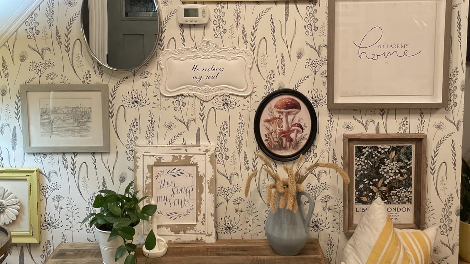
Recipe 1: Entryway “Designer Moment” (Focal Arch + Minimal Accents)
Best for: small entryways, rental apartments, console tables
Formula
-
One arch focal decal centered on the console
-
2–4 small accents nearby
Why it works -
The arch is an instant focal point
-
Small accents feel curated, not cluttered
Example arch focal size: 34.6" × 64.6".
Recipe 2: Calm Bedroom / Nursery (Wide Scene Above Bed or Crib)
Best for: above headboards, above cribs, calming themes
Formula
-
One horizontal scene as focal
-
Keep it visually aligned to bed/crib width
Example: 39" × 17" scene decal.
Recipe 3: Kids Theme Wall (Big Scene + Supporting Sprinkles)
Best for: playrooms, reading corners, themed walls
Formula
-
One large scene as anchor
-
Add smaller decals with consistent spacing (use Spacer Test)
Example: 59.8" × 29.5" scene decal.
Shopping Checklist (So your finished wall stays cohesive)
If you want your wall to look “set” and seamless, plan like this:
The “One Order” Method (especially for symmetry)
If your makeover depends on matching pieces (paired arches, matched sets, themed walls), the cleanest way to reduce mismatch risk is to buy what you need in one order, after you’ve done the mockup and counted pieces.
Quick checklist before checkout
-
Final layout chosen (photo saved)
-
Count pieces needed (+ consider 1 backup if symmetry matters)
-
Confirm sizes fit your wall zone
-
Buy together for the most seamless look
Where to shop
-
Browse the full JIFFDIFF Wall Decals collection (repositionable, removable, damage-free).
FAQ (Good for both shoppers and SEO)
Q: Is there one “correct” spacing?
No. Correct spacing is what looks cohesive from your real viewing distance. Use the 2"/3"/4" Spacer Test.
Q: Why does my wall look messy even with cute decals?
Usually it’s inconsistent spacing or no clear focal point. Proximity (visual grouping) is doing its job—your wall needs consistent rhythm.
Q: Why does it look too high?
Humans prefer comfortable, slightly downward viewing. If you’re lifting your chin to see the focal point, lower it and re-check.
Q: I’m nervous—what’s the safest way to start?
Mock up with painter’s tape and paper shapes first, then install the focal point, then expand outward. Repositionable decals make the process forgiving.
Q: I want a perfectly matched set. What should I do?
Plan, count, and buy in one order—especially if the look depends on symmetry.
Final CTA (simple, confident)
If you want a wall that looks designed (not random), don’t start with sticking—start with:
-
Focal point
-
Comfort height
-
Consistent spacing (tested from 6–8 ft)
Then shop your full set at once from the JIFFDIFF Wall Decals collection.
Shop the Look — Quick Buying Guide
Ready to turn your plan into a finished wall? Start here:
-
Browse all Peel & Stick Wall Decals (Collection)
→ Wall Decals Collection -
Pick a strong focal point (Best for entryways & statement walls)
→ Arch Tropical Garden Scene (34.6" × 64.6") -
Build a calm bedroom / nursery layout (Wide scene option)
→ Underwater Scene (39" × 17") -
Create a themed kids wall (Large scene anchor)
→ Marine Animals (59.8" × 29.5") -
Planning a matched set? Read this before you place the order
→ Color Consistency: Why You Should Buy Decals in One Order -
Want to test first (color/scale/placement)? Use this guide
→ Should I Order Samples or Test Sections Before Committing?
%0APeel-and-stick%20wall%20decals%20are%20one%20of%20the%20easiest%20ways%20to%20refresh%20a%20room%E2%80%94without%20paint,%20without%20a%20contractor,%20...)