
Small Room Wallpaper Rules: Scale, Stripe Direction, and Contrast
Wallpaper can absolutely make a small room feel bigger—but only when you choose the right pattern scale, stripe direction, and contrast. Most “small room advice” online oversimplifies it into “go light and tiny.” That’s why so many people end up with a room that feels even busier.
3-second takeaway:
Small rooms don’t need tiny patterns—they need clean visual flow.
Get these three rules right, and wallpaper becomes an instant space upgrade instead of visual clutter.
The small-room mistake most people make
People think “small room = small print.” But here’s the truth:
-
A medium busy pattern (not tiny, not large) often looks the messiest because your eye keeps “counting repeats.”
-
Hard contrast creates stronger edges, which makes walls feel closer.
-
Stripes don’t magically enlarge a room—they simply tell your eyes where to travel.
The goal isn’t to “hide the room.” The goal is to control what your eye notices first: height, width, or calmness.
Rule #1: Scale (pattern size) decides whether the room feels open or crowded
Pattern scale is the biggest “wow vs. regret” factor.
The 3 safest scale choices
1) Large-scale, simple motifs (surprisingly great for small rooms)
Big shapes = fewer repeats = less visual noise. Large patterns can create depth and feel intentional.
2) Micro patterns that read like texture
Very small, low-contrast patterns often blur into a soft texture from a distance (like linen or plaster), which keeps the room calm.
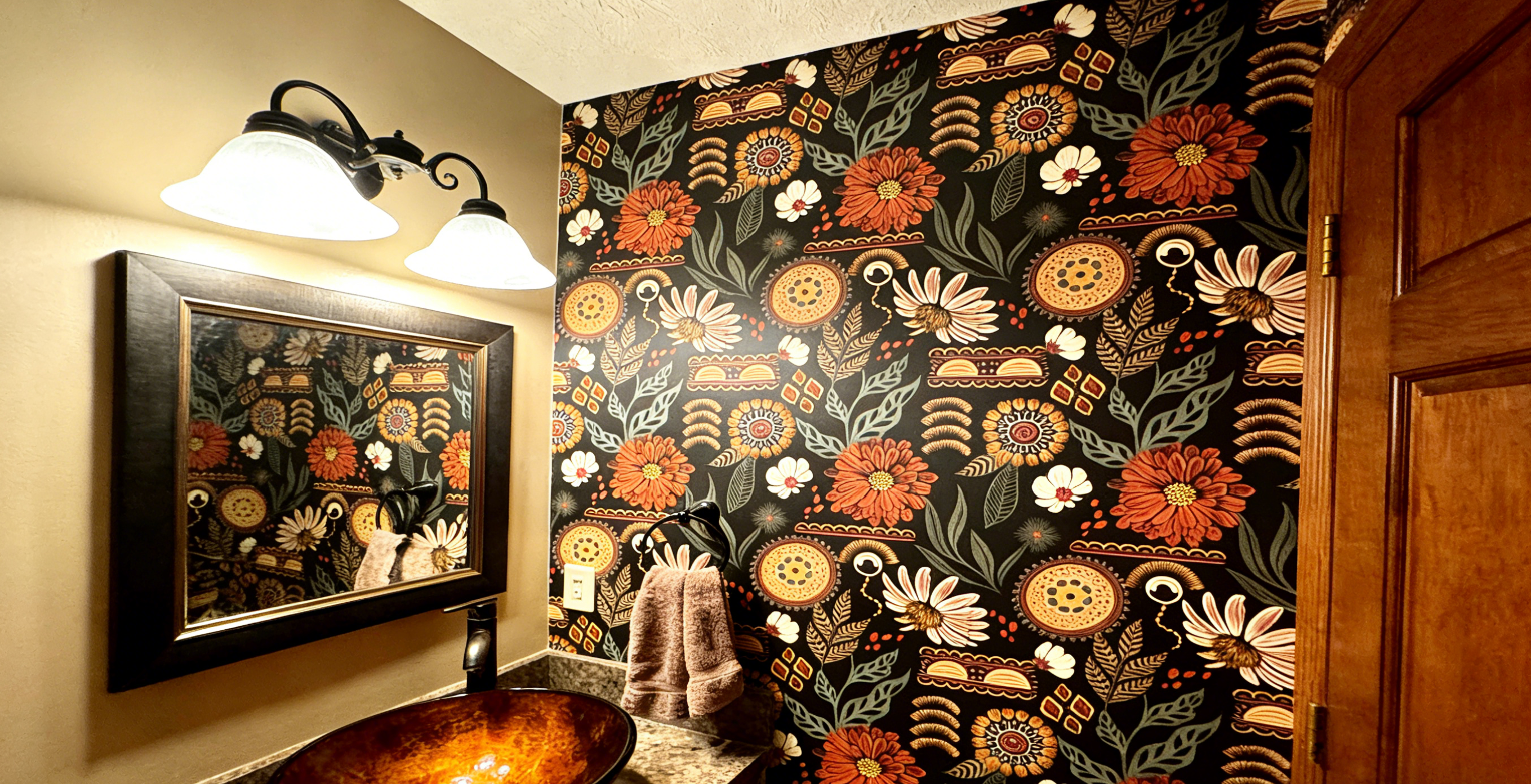
3) Medium busy patterns (the risky zone)
This is where many small rooms start to feel chaotic—enough detail to feel busy, but not bold enough to feel designed.
Quick scale test (no measuring):
Stand in the doorway. If you immediately feel “calm design,” the scale works.
If your eyes start tracking repeats and edges, the scale is fighting the room.
Rule #2: Stripe direction tells your eye where to go
Think of stripes as a visual arrow—not a magic trick.
Vertical stripes (pull the eye up)
-
Best when: stripes are soft or low contrast
-
Risky when: stripes are high contrast + narrow, which can feel taller but tighter
Horizontal stripes (pull the eye across)
-
Best when: the room feels narrow and you want more width
-
Risky when: the ceiling already feels low (too much horizontal movement can “press down”)
Diagonal / chevron (adds energy)
-
Can look designer, but it increases visual activity
-
Safer when: contrast is low and the pattern isn’t tiny
Non-directional patterns (the universal safe choice)
Organic or abstract patterns are forgiving in real homes—especially if your room has odd corners, short walls, or rental quirks.
One-line rule:
Stripes don’t make space bigger—they move attention. Choose the direction you want attention to travel.
Rule #3: Contrast is the real secret to making small rooms feel bigger
Most people focus on “light vs dark.” In small rooms, contrast matters more than color.
High contrast = stronger boundaries (often feels smaller)
Sharp black/white, crisp geometrics, and bold stripe contrast can “slice” the room into segments. Segments feel tighter.
Low contrast = softer edges (often feels larger)
Tone-on-tone designs and close color families blur boundaries. Blurred boundaries feel more open.
The surprise truth: dark can work
A dark, low-contrast, matte look can recede and feel deeper.
A light, high-contrast, glossy look can pop forward and feel closer.
Safest “make it feel bigger” combo:
Matte + low contrast + either large simple motifs or micro-texture.
The 30-second picker (choose what works for your room)
Use this to decide fast:
Tiny bedroom / small office
-
Best: large simple motifs OR micro texture
-
Contrast: low to medium (avoid harsh black/white)
Narrow hallway
-
Best: horizontal movement OR non-directional pattern
-
Scale: micro texture or large simple shapes
Powder room
-
You can go bolder because it’s a “moment” space
-
Keep it intentional: choose either big and graphic or soft and textured (avoid medium busy)
Low ceiling
-
Best: soft vertical movement or non-directional
-
Avoid: heavy horizontal + high contrast
Lots of angles / older home / rental walls
-
Best: non-directional patterns + matte finish
-
They hide “not-perfect” lines and keep things forgiving
Common mistakes that make a small room feel smaller
-
Choosing a pattern that’s medium busy
-
Using high-contrast stripes on short or irregular walls
-
Going bold on every wall when one focal wall would feel cleaner
-
Ignoring lighting (a pattern that feels fine at noon can look chaotic at night)
The 2-minute sample test (the step that prevents regret)
Before committing, do this once:
-
Place a sample at eye level on the wall you’ll see first.
-
Check it in daylight and night lighting.
-
Step back to the doorway and take a quick phone photo.
-
Ask: Does it feel calm and open—or visually busy?
-
If it feels busy: reduce contrast, simplify scale, or choose non-directional.
Next step buttons (no links):
Order Samples / Chat for a Room Check
FAQ (fast answers)
What wallpaper makes a small room look bigger?
Matte, low-contrast designs with either large simple motifs or micro-texture usually feel the most open.
Are stripes good for small rooms?
They can be—if contrast is controlled. Stripes guide attention, so choose the direction based on whether you want height or width.
Is a large pattern bad for a small room?
Not at all. Large patterns can look cleaner because there are fewer repeats—less visual clutter.
Should small rooms only use light colors?
No. Low contrast and low glare matter more than “light vs dark.” Dark matte can recede beautifully.
Should I wallpaper all walls or just one?
If you’re unsure, start with one focal wall. It’s the easiest high-impact move in a small room.
Final takeaway
Small rooms don’t need “safe wallpaper.” They need smart wallpaper.
Follow these rules:
-
Scale: big simple or micro-texture (be careful with medium busy)
-
Direction: stripes guide attention—use them intentionally
-
Contrast: lower contrast usually feels more open
If you’re on the fence, do the 2-minute sample test—your doorway view will tell you the truth instantly.