
Statement Wall Placement: Where It Should Go (and Where It Shouldn’t)
Most people believe a statement wall is simply about choosing a bold wallpaper or a dramatic color.
Interior designers see it differently.
The success of a statement wall has far less to do with the design itself and far more to do with where you place it.
Put it on the right wall, and the entire room suddenly feels intentional and balanced.
Put it on the wrong one, and even the most beautiful wallpaper can make a room feel smaller, awkward, or visually chaotic.
The secret isn’t the pattern.
It’s placement.
What Is a Statement Wall?
A statement wall (often called an accent wall) is a single wall designed to become the visual anchor of a room.
Instead of decorating every surface, designers focus attention on one strategic area.
A statement wall might feature:
-
Bold wallpaper
-
A contrasting paint color
-
A mural or oversized pattern
-
Textured panels or wood slats
But its real purpose isn’t decoration.
It’s visual direction.
A well-placed statement wall guides the eye, defines the layout, and creates a natural focal point.
When it’s done correctly, the room feels designed rather than decorated.
The One Rule Designers Always Follow
Professional designers typically follow one simple rule:
Your statement wall should be the wall your eyes naturally land on first when you enter the room.
This is usually the architectural focal point.
Instead of fighting the room’s natural layout, designers amplify it.
The Best Places for a Statement Wall
Certain wall placements almost always work.
These locations already hold visual importance in the room.
Behind the Bed (Bedroom)
In bedrooms, the most natural focal point is the headboard wall.
This placement works because the bed already anchors the space.
Adding wallpaper or a bold design behind the bed:
-
frames the furniture
-
adds depth to the room
-
creates a balanced layout
That’s why statement walls behind beds are one of the most common interior design strategies.
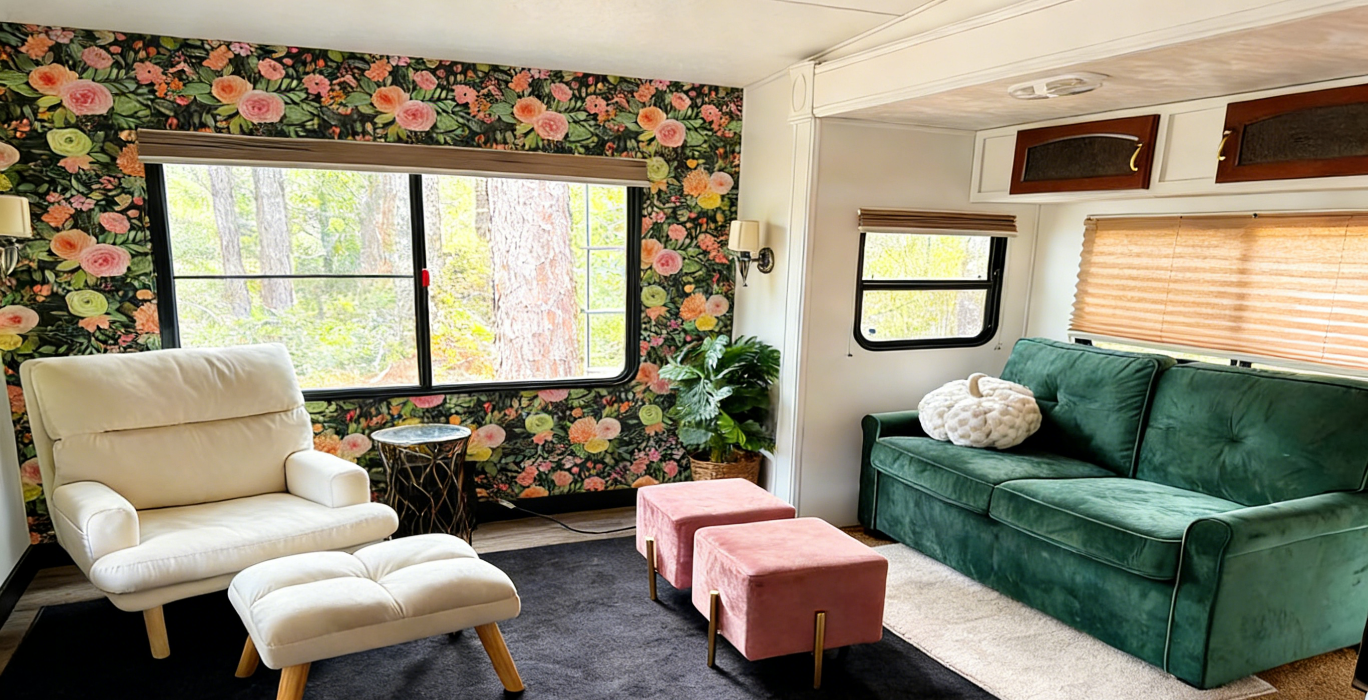
Behind the Sofa (Living Room)
In living rooms, designers frequently choose the wall behind the sofa.
This creates a visual backdrop for the seating area.
It helps:
-
define the living space
-
anchor the furniture arrangement
-
create balance in open layouts
A bold wallpaper here can make the entire living area feel more intentional.
The Back Wall of a Small Room
In small rooms such as:
-
powder rooms
-
home offices
-
reading corners
-
narrow bedrooms
designers often highlight the farthest wall from the entrance.
This trick creates a sense of depth.
When your eyes are drawn toward the back of the room, the space often appears larger.
It’s a subtle illusion designers use frequently.
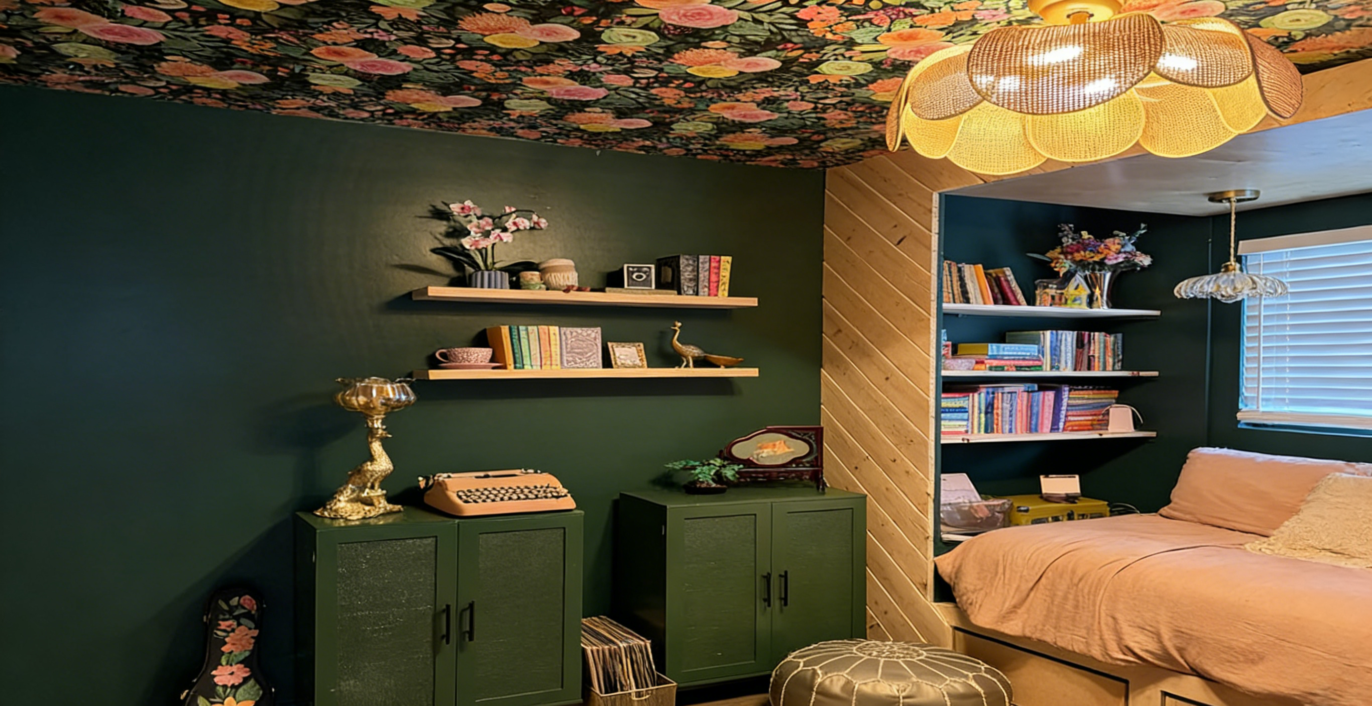
Architectural Niches or Built-Ins
Sometimes the best statement wall isn’t even a full wall.
Smaller architectural sections can work beautifully, including:
-
recessed niches
-
shelving alcoves
-
fireplace surrounds
-
built-in cabinets
Applying wallpaper or a bold color in these areas creates a layered design effect.
This adds personality without overwhelming the entire room.
Where a Statement Wall Should NOT Go
Many statement walls fail for a simple reason.
They’re placed randomly.
Here are the most common mistakes designers try to avoid.
Walls Filled With Doors or Windows
A statement wall needs visual continuity.
Walls that contain multiple doors or windows interrupt the design.
Patterns get broken up and the effect weakens.
For a statement wall to work, the surface should feel uninterrupted and intentional.
Narrow Side Walls
Small side walls may seem like easy places for accent color.
But they rarely create a strong focal point.
Instead, they can make the room feel unbalanced.
Designers prefer accent walls that feel connected to the room’s main layout.
Walls That Compete With the Focal Point
Every room already has a natural focal point.
This might be:
-
a fireplace
-
a bed
-
large windows
-
a media wall
If your statement wall competes with that feature, the room feels visually confusing.
The accent should support the focal point, not fight it.
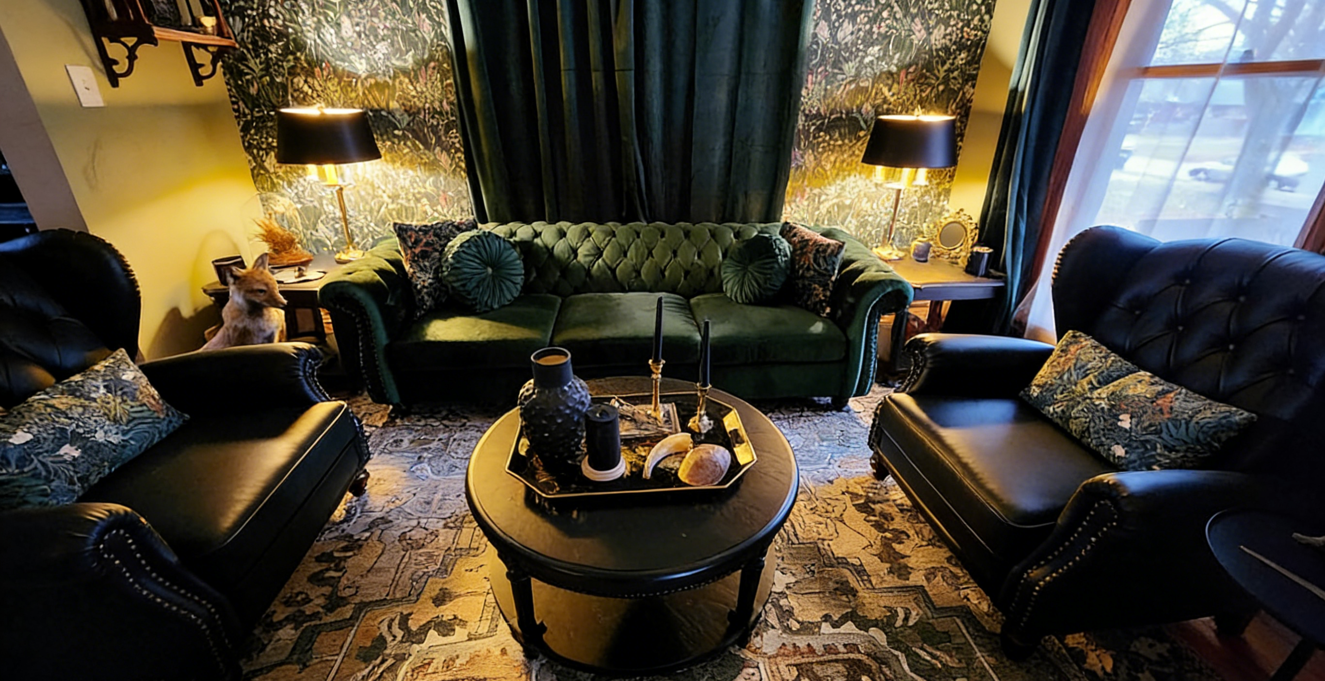
The Designer Concept Most People Miss: Visual Weight
Interior designers often think in terms of visual weight.
Bold wallpaper, dark colors, and large patterns carry more visual weight than neutral surfaces.
That’s why statement walls work best when they align with the room’s existing structure.
Examples include:
-
behind large furniture
-
around fireplaces
-
inside architectural frames
When visual weight is balanced with the room layout, everything feels harmonious.
When it isn’t, the room feels slightly “off.”
Why Statement Walls Work Especially Well in Small Rooms
Small spaces often benefit the most from statement walls.
Instead of covering every wall, designers concentrate personality into a single area.
This prevents the room from feeling cluttered while still adding character.
Statement walls are especially popular in:
-
powder rooms
-
entryways
-
reading nooks
-
small bedrooms
Because these spaces are compact, even a small design change can make a dramatic impact.
Quick Designer Checklist Before Choosing Your Statement Wall
Before installing wallpaper or bold paint, ask yourself:
Does this wall naturally attract attention?
Is the wall visually uninterrupted?
Does it support the room’s focal point?
Will the design balance the furniture layout?
If the answer is yes to most of these questions, you’ve likely found the right wall.
The Real Secret Behind Statement Walls
A statement wall isn’t about being louder.
It’s about being strategic.
The right placement guides the eye, anchors the room, and creates visual balance.
The wrong placement does the opposite.
Before choosing a dramatic wallpaper or bold color, take a moment to study the room.
Ask yourself one simple question:
Where should the room’s story begin?
That’s the wall worth highlighting.