
Light vs Dark in Small Spaces: The Surprise Truth (With Examples)
If you’ve ever hesitated to wallpaper a small room, you’ve probably heard the same advice: “Go light—it’ll make the space feel bigger.”
That rule sometimes works… but it’s not the full truth.
The surprise truth: In small spaces, contrast and glare often matter more than “light vs dark.”
A dark look can feel deeper and calmer when it reduces harsh edges. A light look can feel smaller when it creates hard boundaries or reflects glare—especially under night lighting.
3-second takeaway:
Small rooms feel bigger when edges feel softer, glare is low, and the pattern scale feels intentional.
Why “light = bigger” isn’t always true
Small rooms feel tight when your eyes can clearly “trace” the boundaries—where wall meets trim, where wall meets ceiling, where corners jump out.
Three things make those boundaries feel stronger:
-
High contrast edges (for example: bright wall + dark trim, or sharp black/white patterns)
-
Glare (shiny finishes reflecting hotspots)
-
Busy mid-scale patterns (your eyes keep counting repeats)
When you reduce those three, a room can feel calmer and more open—even if the wallpaper is darker.

The real drivers of “bigger vs smaller” (simple rules)
1) Edge Contrast (the #1 factor)
If a wallpaper choice makes the perimeter of the room “pop,” the room often feels smaller.
If a wallpaper choice softens transitions and edges, the room feels more open.
Shortcut:
-
High contrast = sharp edges = tighter feel
-
Low contrast = softer edges = more open feel

2) Sheen (glare) matters as much as color
Shiny finishes bounce light and can brighten a space—but they also create hotspots and can highlight wall texture. In small rooms, glare can make walls feel “closer.”
Safest choice for small rooms: matte / low-glare finishes.

3) Pattern Scale controls “calm vs busy”
Small spaces don’t need tiny patterns. They need clean visual flow.
Often the safest pattern scale is:
-
Large simple motifs (fewer repeats = less visual clutter), or
-
Micro-texture (reads like a finish from a distance)
The most common risky zone is medium busy—not bold enough to feel intentional, but busy enough to feel crowded.
Light vs Dark: the quick decision guide (30 seconds)
Choose LIGHT when…
-
The room has very little natural light and you want a brighter mood
-
You can keep contrast controlled (no harsh wall/trim battles)
-
You’re using matte/low-glare finishes to avoid hotspots
Light works best when it’s calm, not stark.
Choose DARK when…
-
You want depth, mood, and a “box disappears” effect
-
The room has awkward angles or short walls and you want a more unified look
-
You can keep it low to medium contrast and low glare
Dark works best when it’s intentional, not high-contrast and shiny.
Either light or dark can win if you control these 3:
-
Contrast (how hard the edges read)
-
Sheen (glare vs calm)
-
Pattern scale (busy vs intentional)
Wallpaper rules that almost never fail in small spaces
Rule 1: Reduce “hard cut” contrast
If you want the room to feel bigger, choose:
-
tone-on-tone patterns
-
close color families
-
softer edges (organic or watercolor-like transitions)
If you want drama, you can still go bold—just be aware that sharp contrast will feel more graphic and defined.
Rule 2: Matte beats glossy for real-life small rooms
Matte finishes:
-
reduce glare
-
look calmer under night lighting
-
are more forgiving on imperfect walls
Rule 3: Make scale feel intentional
Choose one of these two lanes:
-
Big + simple, or
-
Tiny + textured
Try to avoid “middle busy” if your goal is “bigger and calmer.”
Examples (real-life small rooms and what actually works)
Example 1: Tiny bedroom with one window (light only part of the day)
What people assume: “Go light everywhere.”
What works: Light can work beautifully if contrast stays soft and the finish stays matte.
Try: matte, low-contrast patterns that read calm from the doorway (micro-texture or large simple motifs).
Why: Your eye stops tracing edges and starts reading the room as one continuous surface.
Example 2: Small hallway with no windows (shadows + overhead lighting)
What people assume: “White makes it bigger.”
The surprise: A hallway can feel longer and calmer with a deeper tone that reduces edge contrast.
Try: darker matte, subtle texture, non-directional pattern (so odd corners don’t stand out).
Why: Dark matte can “push back” the walls visually when glare and contrast are controlled.
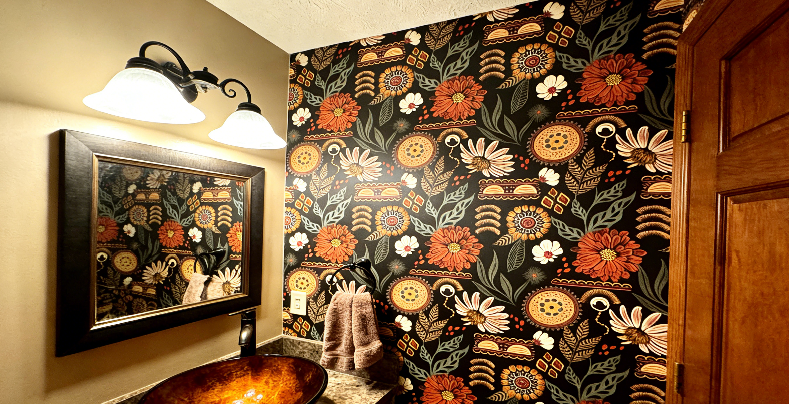
Example 3: Powder room (small, but meant to feel special)
What people assume: “Small space = play it safe.”
What works: This is the best space to go bold—because it’s a “moment room.”
Try: either
-
big, graphic patterns (intentional statement), or
-
dark, textured mood (jewel-box feel)
Avoid medium busy patterns if you want it to feel polished.
Why: Powder rooms don’t need to feel “bigger”—they need to feel designed.

Example 4: Small living room with slightly bumpy walls
What people assume: “Light hides flaws.”
The truth: Sheen matters more than lightness.
A light, glossy look can spotlight bumps. A matte look with texture can hide them.
Try: matte + textured-look + medium detail (avoid sharp stripes/grids).
Why: Lower glare softens the shadows that outline imperfections.
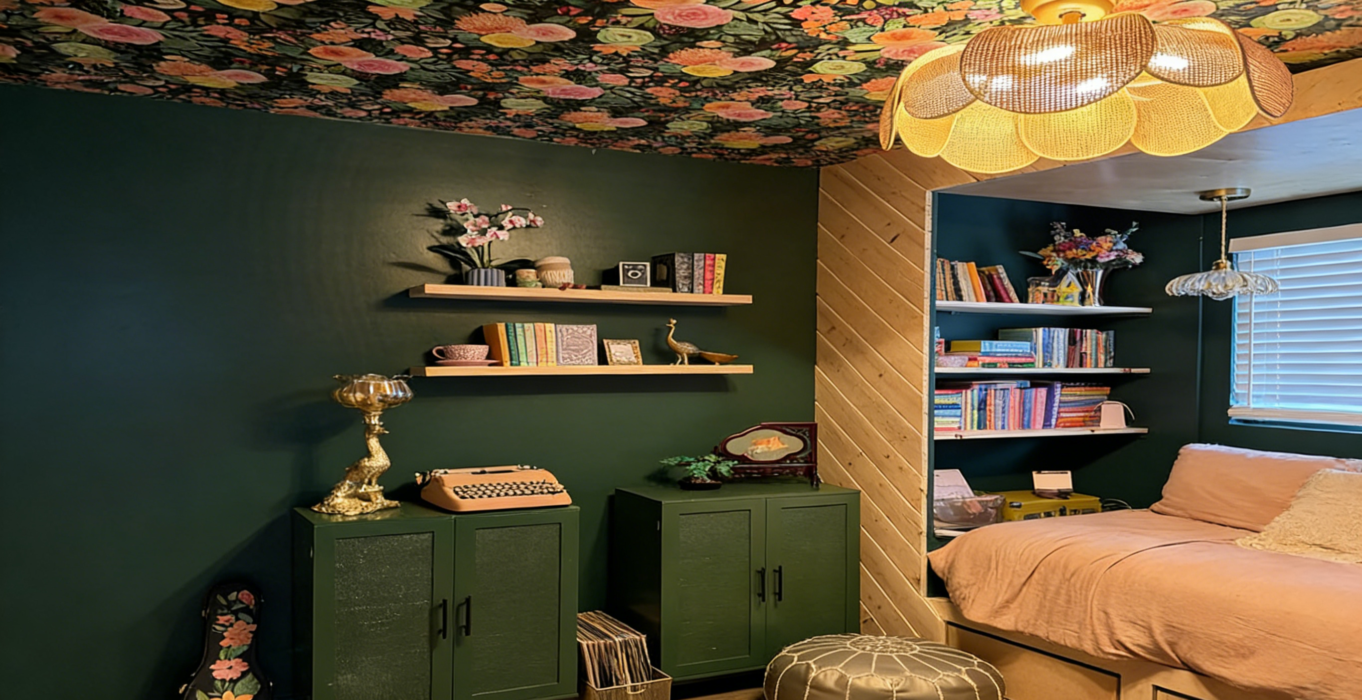
Example 5: Corner studio / rental with odd angles and mixed lighting
What people assume: “Neutral light only.”
The surprise: A deeper, low-contrast pattern can unify awkward geometry and feel more expensive.
Try: non-directional patterns, matte finish, tone-on-tone palettes.
Why: Your eye stops measuring every angle because the room reads as one cohesive envelope.
Example 6: Small kitchen nook (needs wipeability)
What people assume: “Gloss is required.”
What works better: low-sheen (not high gloss) + pattern detail that stays forgiving.
Try: low-sheen finishes with medium detail; avoid super shiny, high-contrast stripes.
Why: You get practical cleanability without turning the wall into a mirror.
Common mistakes that make small rooms feel smaller
-
Using high-contrast trim with very light walls (it outlines the room like a box)
-
Choosing glossy finishes (glare + imperfections + “walls feel closer”)
-
Picking medium busy patterns that add visual clutter
-
Going bold on every wall when one focal wall would look cleaner
-
Only judging in daylight (a room can flip from “cute” to “chaotic” at night)
The 2-minute test before you commit (do this once)
This is the simplest way to avoid regret—especially in small rooms.
-
Tape a sample at eye level on the wall you see first.
-
Check it in daylight and again under night lighting.
-
Stand in the doorway and take a quick phone photo.
-
Ask: Does it feel calm depth—or busy edges?
-
If it feels smaller: reduce contrast, reduce shine, simplify scale.
Next step: If you’re between two options, the safer “small room win” is usually the more matte, lower-contrast choice.

FAQ (fast answers)
Do light colors always make a small room look bigger?
No. Light can feel bigger when contrast is soft and glare is low. Light can feel smaller if it creates strong outlines or shiny hotspots.
Can dark wallpaper make a small room feel larger?
Yes—especially when it’s matte and low-contrast. Dark can recede and create depth when it reduces edge contrast.
What matters more: color or contrast?
In most small spaces, contrast matters more. Hard contrast creates sharp boundaries that can make the space feel tighter.
Should I wallpaper all walls or just one in a small room?
If you’re unsure, start with one focal wall. It’s the cleanest high-impact option and keeps the room from feeling busy.
What finish is best for small rooms—matte or glossy?
Matte (low-glare) is usually best. Gloss can add brightness but may increase glare and highlight wall texture.
What pattern scale is safest for small rooms?
Either large and simple (fewer repeats) or micro-texture (reads like a finish). Medium busy patterns are the most likely to feel cluttered.
Final takeaway
Small spaces aren’t about “light vs dark.” They’re about contrast, sheen (glare), and pattern scale.
If you want the safest, most “bigger feel” result:
matte + low contrast + either large simple motifs or micro-texture.
And before you commit, do the 2-minute sample test—your doorway view will tell you the truth instantly.