
Article: Team Dots or Team Stripes? Settling the Wallpaper Debate, Room by Room
Team Dots or Team Stripes? Settling the Wallpaper Debate, Room by Room
You’ve narrowed it to two. One is charming and slightly retro; the other is architectural and quietly expensive-looking. You’ve scrolled both hashtags. Pinterest insists dots are having a moment. Your partner says stripes look like a dentist’s office. Your mother says dots look like a nursery. And the wall stays beige for another six months.
We’ve hung both — in low-ceiling rentals, in narrow hallways, in rooms with exactly one small window. So here’s the honest verdict, arranged the way you actually need it: not “both are lovely,” but which one wins in which room, at what scale, under what light. Pick a side, or read to the end, where we make the case for cowardice.
What Dots Do — and What They Don’t
Dots are rhythm without direction. Because the eye has nowhere specific to travel, a dotted wall reads as softer and more decorative than a striped one. That’s why dots make small, awkward rooms feel like boutique hotel bathrooms and dressing rooms: they add charm without adding architecture.
They also disguise. A dotted wall is forgiving of a slightly out-of-level ceiling, a wall that isn’t perfectly flat, and furniture that doesn’t line up. There’s no grid to betray the flaws.
The failure mode is scale. A dot that’s too large on a narrow wall becomes a costume; a dot that’s too small turns into visual static, reading as fuzz from across the room. The test is simple: stand in the doorway. If you see dots, the scale is right. If you see texture or confetti, it isn’t. And the ground color matters more than the dot color — a soft oatmeal or warm cream ground keeps dots sophisticated where a bright white ground tips them toward kids’ room.
Where dots genuinely win: powder rooms, dressing nooks and closets, laundry rooms, kids’ rooms where you want joy without a cartoon, and behind a headboard where you want pattern that won’t compete with bedding.
What Stripes Do — and What They Don’t
Stripes are architecture you can install in an afternoon. A vertical stripe pulls the eye upward, so a low ceiling reads taller, a narrow hallway gains procession, and a wall with three doors stops looking like a jigsaw puzzle. If your room’s problem is proportion, stripes are the fix — dots only decorate it.
The failure mode is contrast. Wide, high-contrast stripes in a small room can feel like a tent. Horizontal banding shortens a space. And crisp graphic stripes are the least forgiving option in wallpaper, because they demand a plumb line: on a wall that’s slightly out of level, they look like they’ve been drinking.
This is where a textured stripe earns its keep. A linen-look or hand-painted stripe has a soft edge, so small alignment variations disappear into the texture instead of announcing themselves. You get the height benefit without the surveying equipment.
Where stripes win: attic and basement bedrooms, narrow entryways and hallways, dining rooms that want formality, the wall behind a sofa, and any room where the ceiling is the thing you’d most like to change.

The Five Tiebreakers
Ceiling height. Under eight feet, default to vertical stripes. Above nine, either works — dots keep a tall room from feeling like a shaft.
Room size. Small with one window: small-scale dots on a light ground, or a fine textured stripe. Never both at full strength.
Light. Dots hold up better under flat, even light. Stripes look their best with side light that grazes the wall — but that same light exposes every seam, so installation quality matters more.
What’s already busy. Gallery wall, patterned rug, printed cushions? Stripes bring order. A minimal room with three objects in it? Dots bring the personality you’re missing.
How long you’ll live with it. Dots read as decorative and forgive a change of furniture. Stripes are a stronger design statement and harder to redecorate around.
The Hybrid Nobody Argues About
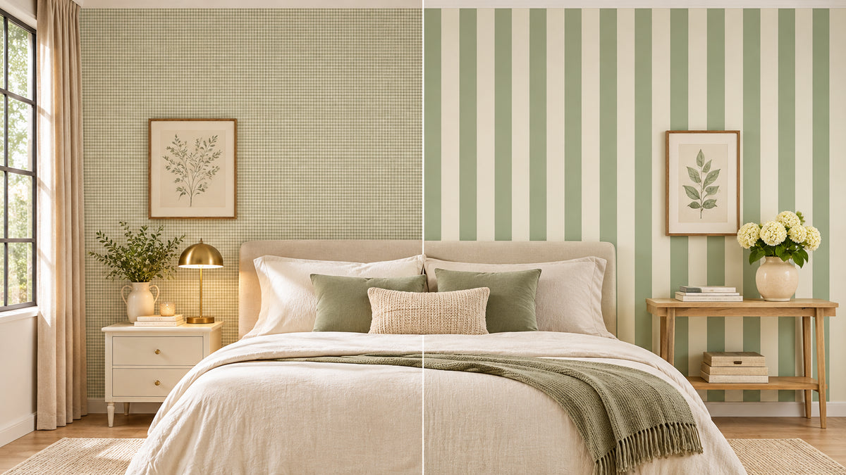
Here’s the thing the debate skips: a huge share of wallpaper sits between the two camps. Gingham is dots on a grid. A fine cross-stitch stamp pattern is dots with a handmade edge. A broken or dashed stripe reads as texture rather than graphics. A distressed, brushed stripe looks hand-painted and hides wall imperfections better than either pure option.
If you’ve been arguing for a week, this is usually the answer — a pattern with the softness of dots and the structure of stripes. It’s also the most renter-friendly choice, because a textured or broken pattern survives imperfect walls, uneven light, and the fact that you’ll be looking at it every day for years.
Before and After: Same Room, Two Verdicts
Take one small spare bedroom in a European apartment: 2.4-metre ceiling, one window, a radiator under it, a bed that only fits one way.
With large dots on a cream ground, the room becomes charming and slightly playful — good for a guest room, better for a child’s room, and it makes the low ceiling a non-issue because nobody’s eye is being pulled anywhere.
With a soft vertical linen stripe on the same walls, the room grows. The ceiling reads higher, the radiator looks intentional, and the bed looks placed rather than parked. It’s the same square footage, but one version feels like a room someone designed.
Neither is wrong. One is a mood; the other is a correction. Decide which your room actually needs.

Shop Your Side
Team Dots:
- Oatmeal Gingham Warm Neutral Textured Peel and Stick Wallpaper — the dots-on-a-grid option that ends the argument: warm, textured, and far more grown-up than a polka dot.
- Rustic Cross Stitch Stamp Floral Cottage Peel and Stick Wallpaper — hand-stamped dot motifs with cottage softness. The one to choose for a bedroom that shouldn’t feel designed.
Team Stripes:
- Sage Green Linen Texture Vertical Stripe Wallpaper — pale green over a woven ground. The ceiling-height trick, in the calmest possible color.
- Blush Rose Stripe Peel and Stick Wallpaper — a softer take on the stripe, warm enough for a bedroom and pretty without being sweet.
- Brown Linen Stripe Peel and Stick Wallpaper — linen weave in tonal brown stripes: the “quiet luxury” version for living rooms and home offices.
- Frosted Sugar Cube Striped Geometric Peel and Stick Wallpaper — a broken, frosted stripe that reads as texture up close and structure from the doorway.
Still undecided? Order the Multi-Style Wallpaper and Mural Sample Kit, tape a dot and a stripe side by side on the actual wall, and leave them there for a week. Morning light, evening light, one rainy Tuesday — your wall will vote before you do. You can also compare every option in the full Geometric collection.
Every design here is peel and stick, so whichever team wins, installation is an afternoon and removal is a slow peel from a corner — no paste, no steamer, no conversation with your landlord.
So: dots or stripes? Tell us in the comments. We’ve stopped being neutral about it.

Laisser un commentaire
Ce site est protégé par hCaptcha, et la Politique de confidentialité et les Conditions de service de hCaptcha s’appliquent.