

One Roll, Big Impact: Budget Statement Wall Layouts That Actually Work
Think you need multiple rolls of wallpaper to make a statement?
Most people do.
Designers don’t.
In fact, some of the most impactful interiors are created with just one roll of wallpaper—placed strategically.
The difference isn’t the budget.
It’s the layout.
The Quick Answer
You can create a high-impact statement wall with one roll of wallpaper by focusing on placement instead of coverage.
Designers typically use one roll to:
-
frame key furniture like beds or sofas
-
highlight vertical sections
-
style small architectural areas
-
define the back wall of compact rooms
The goal isn’t to cover everything.
It’s to guide the eye.
Why Less Wallpaper Often Looks Better
Most people assume more wallpaper creates a stronger design.
In reality, it often does the opposite.
Too much pattern can:
-
overwhelm the space
-
remove visual focus
-
make rooms feel smaller
Using less wallpaper—strategically—creates contrast, clarity, and intention.
This is why one-roll layouts often look more refined than full-wall coverage.
5 One-Roll Layouts Designers Use
1. The Headboard Frame Layout
Apply wallpaper behind the bed, slightly wider than the headboard.
Why it works:
-
creates a clear focal point
-
frames the bed naturally
-
uses minimal material
This is one of the easiest ways to upgrade a bedroom instantly.
2. The Vertical Panel Trick
Install a vertical strip of wallpaper instead of covering the full wall.
Best for:
-
small bedrooms
-
apartments
-
narrow walls
Why it works:
-
draws the eye upward
-
makes ceilings feel taller
-
adds structure without clutter
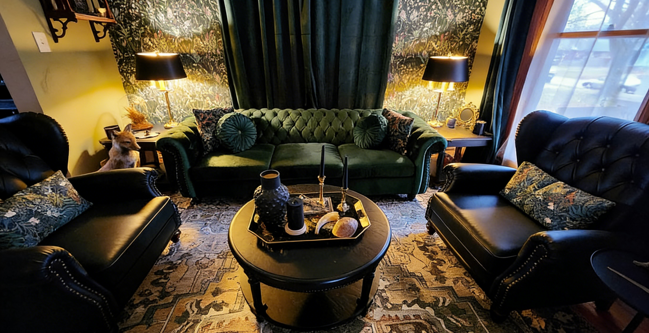
3. The Sofa Backdrop Layout
Apply wallpaper only behind the sofa area.
Why it works:
-
defines the seating zone
-
creates balance in open spaces
-
avoids visual overload
This is especially effective in modern living rooms.
4. The Back Wall Focus
Use wallpaper only on the farthest wall in a small room.
Perfect for:
-
powder rooms
-
entryways
-
reading nooks
Why it works:
-
creates depth
-
visually enlarges the space
-
adds a strong focal point
5. The Niche Highlight
Apply wallpaper inside:
-
wall niches
-
shelves
-
built-ins
Why it works:
-
adds detail without commitment
-
creates a layered, custom look
-
delivers maximum impact with minimal material
The Designer Trick Most People Miss
Statement walls don’t need to be large.
They need to feel intentional.
Designers often use:
-
furniture placement
-
natural boundaries
-
visual framing
to make a small section feel like a complete feature.
How to Make One Roll Look Premium
Even a budget setup can look high-end when done right.
Focus on:
Clean edges
Sharp boundaries make the design feel intentional.
Contrast
Neutral surroundings enhance bold patterns.
Pattern scale
Larger patterns create a more premium look.
Lighting
Good lighting adds depth and texture.
Common Mistakes to Avoid
-
placing wallpaper randomly without a focal point
-
choosing overly busy patterns in small spaces
-
applying wallpaper to walls with too many interruptions
-
trying to stretch one roll across awkward layouts
Budget design works best when it looks planned—not improvised.
Who This Works Best For
This approach is ideal for:
-
renters
-
small apartments
-
DIY beginners
-
quick room upgrades
-
budget-friendly makeovers
It’s one of the fastest ways to refresh a space without major renovation.
Final Thought
You don’t need more wallpaper.
You need a smarter layout.
When placed intentionally, even one roll can transform how a room looks and feels.
Before covering an entire wall, consider this:
What if less could actually do more?
Looking to try a statement wall without committing to a full room?
Start with one roll. It’s the easiest way to experiment with bold design while keeping your space balanced and budget-friendly.
